Archive for May 2016

OVERALL / PERSONAL OUGD603 EVALUATION

OUGD603

Overall the OUGD603 module consisted of 11 briefs and a 10+ days work experience at Rockfield Media, Bolton and Black Moniker, Manchester. The guidelines at the start of the year of 2 live briefs, 2 visiting profession briefs, 2 collaboration briefs and 2 competition briefs were all met and some where exceeded.

This module and the level 6 PPP have been the modules were I felt my work has benefited the most within as both these modules allowed the freedom to express my own interests and designs. The briefs I felt I excelled in are the Black Moniker briefs, as this involved my main interests and skill sets, therefore I felt more comfortable when designing and experimenting with new techniques. The BMX briefs were also a highlight for myself as these briefs were live briefs for a big clients and the work will exhibited all over Manchester city centre. This brief was a massive success as Rockfield Media won the pitch using the design which I produced while on my 10 day work placement.

As a designer, I defiantly prefer to work by myself rather than in a group as I can chose thework of my personal interests. However, by surround myself with other designs I get alongwith personally, group tasks were for more enjoyable this year.

I am happy with my submission and have a portfolio which I am proud of as it is at a levelwhere I am confident to show design studios. However, if I was to do this module again, I would create more physical designs, I sometimes I get to comfortable designing digitally and end with not a lot of physical designs, who are beneficial to show studios. This could always be improved on after the module has finished.

Monday 23 May 2016 by James Smith
Categories: , | Leave a comment

OUGD603 - Project evaluations

1 - Creative Networks - Evaluation

For this project, I collaborated with Ryan Daley to produce a proposal for the Creative Networks Advertising ‘At Leeds’ project in the form of multiple posters and a video. This brief was chosen as it was a competition brief that would receive good publicity.
The final posters were created by myself on Adobe Illustrator and Photoshop, using the examples of Andrew Graham-Dixon and Daft Punk.  I also created an introduction video on Adobe AfterEffects, using Daft Punk as the example.  All final designs were created digitally, as this is the area I excel in and I was lead designer and therefor, my work would be the face of this project. However, the posters will be printed so they have been designed to be suitable for print. 

Overall, all the final outcomes were completed to a standard the group was happy with.  However, we did not manage to win the task.  If I was to do this task again, I would have been more ambitious and created a unique piece of work that was not just a digital design.


2 - Black Moniker, Abyss - Evaluation

For this project, I produced an indoor photoshoot, held in Manchester.  From this, I created product shots and an indoor look-book.  I also directed an outdoor photoshoot in Bolton and created an outdoor look-book and promotional photographs for social media.  In addition, I collaborated with a video team to produce a promotional video.  I also coded Black Moniker’s new website www.blackmoniker.com   

For my photoshoots, I used a Nikon D3100 camera and edited images in Adobe Photoshop to make sure the model in the product shots lined up and were all consistent for the website.  The look-books were designed in Adobe Illustrator and the main uses for it were digital, therefore the final outcome was an online PDF. When I collaborated with the drone team, I used a Canon 5D camera and worked alongside a drone team.  We then used the Adobe Suite to finalise the promotional video.  I coded the website using the software, Sublime 2.

The feedback from both the company and their audience was that the promotional material has been the best to date.  All outcomes were produced on time to a standard which both myself and the company were happy with. All went well with the project, however, if I was to do the project again, I would have like to carry out the video editing myself, so that I could call the work my own, instead of a team effort.  However, there was not enough time to do this between the photoshoot and the deadline.


3 - Streetwear publication - Evaluation

For this project, I produced an online publication and a physical publication on ‘How to start  streetwear brand’. 

As this brief was following on from my dissertation, research was mostly finished and designing start quite fast. However the design of this publication was not as important as the content. The design took influence from Japanese culture to highlight how far the streetwear has become.

Feedback gathered from the owner of Black Moniker, a successful streetwear company in Manchester, who gave positive comments on the publication, highlighting that they can relate.  All outcomes were produced on time to a standard which I happy with. All went well with the project, however, if I was to do the project again, I would have like to take more time in creating a physical copy with a Japanese style bind to keep the theme.


4 - Foure, SS16 - Evaluation

For this project, I designed my own T-shirts which were manufactured. I also made a look book with a mixture of indoor and outdoor shots of FOURE clothing, luxury items and vehicles. These photoshoots were held in London and a studio in Bolton.  I also created packaging and labels for the products. To show the concept of ‘street turning into luxury’, I combined rough textured tissue paper with luxury finishes within typography, such as metallic silvers.  I then created labels for the products, which will be used for shop sold items.

I designed my T-shirts by freehand sketch, finalising in Adobe Illustrator.  These designs were sent to a manufacturing company in Wales to be produced.  For all my photoshoots, I used a Nikon D7100. The packaging and labels were created in the Leeds College of Art print room and were screen-printed using metallic silver.  The materials were purchased from Leeds College of Art, however, the string for the labels had to be sourced online.


5 - End of year show - Evaluation

For this project, I collaborated with Ryan Daley to produce a proposal for the End of Year Show for Leeds College of Art to produce multiple posters, advertisements and a publication.  Like Creative Networks, this brief was chosen as it was a competition brief that would receive publicity and it was personal to ourselves.

We decided to propose an idea which differed from the Creative Networks brief, in that our outcome was not to rely on digital media alone. The name of the exhibition chosen was ‘Going Down in History’. I chose this name, as the exhibition is special as it celebrates the 170th anniversary of the College.

Like the Creative Networks brief, I also took the role of the lead designer.  The design which I produced started with a simple digital design including the name and details.  The idea of the final outcome would be that all the past exhibition posters would be torn and then laid over the main, current poster, with the name and details of the End of Year Show still visible.  This created a colourful outcome which allowed us to acknowledge previous shows.  In addition to advertisements, we decided to take this project further by creating a proposal for the End of Year invitations.

Overall, we were very pleased with the outcome.  We felt that the name of the exhibition was probably stronger than the designs, therefore, if I was to do this project again, I would try to create a different design that would be as strong as the name.


6 - Triptych - Evaluation

For this project, I produced an A3 poster to be exhibited in the corridor of Leeds College of Art for the Triptych brief.  The final design was an illustration piece inspired by the social media trend of drawing your favourite cartoon character, wearing your favourite streetwear clothing.  I chose this brief as it was a good opportunity to add a different style of my design work into my portfolio.  This was also a good design decision, as it linked my illustration work with the fashion project that I had completed.

For my design, I created the illustration in Adobe Illustrator and sent the design to the leader of the project to be printed in Leeds College of Art.  The cartoon character I chose was Bart Simpson and I chose to design him wearing Black Moniker clothing to create a consistency with other briefs. I also added a pair of Adidas x Kanye West shoes, as these were the most popular trainer in the streetwear fashion industry on the date of creation.  

Overall, this brief was beneficial for me, as it allowed me to create a portfolio piece, showing my Illustration style of work, which created a larger variety of design styles for my portfolio.


7 - Website design - Evaluation

For this project, I designed/re-designed a series of websites so that I could include more website work for my portfolio and to improve my website design skills. This task was started by creating students’ websites for when they leave Leeds College of Art. The websites completed were for Matthew Brewer, Ryan Daley and Maxine Harris. After completing student websites, I designed a website for a fashion company, ‘Coterie’, and then finalised the brief by creating a re-design proposal for the skateboard shop ‘Scene’. I then decided to extend this brief again by brief creating a web platform for the Adidas x Yeezy, Season one.

All student websites were fully coded, using the software ‘Sublime 2’ and are all live and hosted by myself.  The ‘Coterie’ website is a shopify website that allows the freedom of personal coding.  This website is hosted by the owner of the shop and is ready to go live. However, the launch date is after the OUGD603 hand in. The ‘Scene’ website was created on Adobe Illustrator, as this design is just for proposal purposes. This add on to the brief was to add another clothing website to my portfolio and to link this brief with other projects. 

Overall, this brief was extremely successful because every website created for the clients have been approved and are live. If I was to extend this brief, I would show ‘Scene’ the website proposal I produced and possibly create the website for them. I did not do this within this brief, as I would not have had time to code their website, as I had many other briefs which took priority.  


8 - DR.ME - Evaluation

For this project, I designed a mailer for myself, which included a series of my work and my personal details. This brief was chosen as it was a visiting professional project which could link my work with the PPP Self Branding Module, as it was self-promotion. 

The final outcome was an A5 case with a pocket to accommodate a series of postcards showing my work and contact details. This case was designed in Adobe Illustrator and were printed onto an A4 card to be folded in half. The design also included my logo and aesthetically had the style of my personal branding. 

Overall, I am pleased with the final outcome, as the design met the brief requirements and kept my own style of work.  This outcome would also be useful for myself, as I do a lot of freelance work and this design could be sent or given to clients.


9 - Black Moniker, SS16 - Evaluation


For this project, I produced an indoor photoshoot, held in Manchester and London.  From this, I created product shots and an indoor look-book.I also directed an outdoor photoshoot in London and created an outdoor look-book and promotional photographs for social media. Finally I added coding to the Black Moniker’s website to make it up to date with new styles www.blackmoniker.com   

For my photoshoots, I used a Nikon D7100, which was an update from the Autumn/Winter campaign and edited images in Adobe Photoshop to make sure the model in the product shots lined up and were all consistent for the website.  The look-books were designed in Adobe Illustrator and the main uses for it were digital, therefore the final outcome was an online PDF. I coded the website using the software, Sublime 2.

The feedback from both the company and their audience was that the promotional material has been the best to date.  All outcomes were produced on time to a standard which both myself and the company were happy with. All went well with the project and it is still taking place as the release date is after the OUGD603 final hand in.


10 - Xraces branding - Evaluation

SEE FOLDER


11 - Bmxtreme - Evaluation

SEE FOLDER

Sunday 22 May 2016 by James Smith
Categories: , | Leave a comment

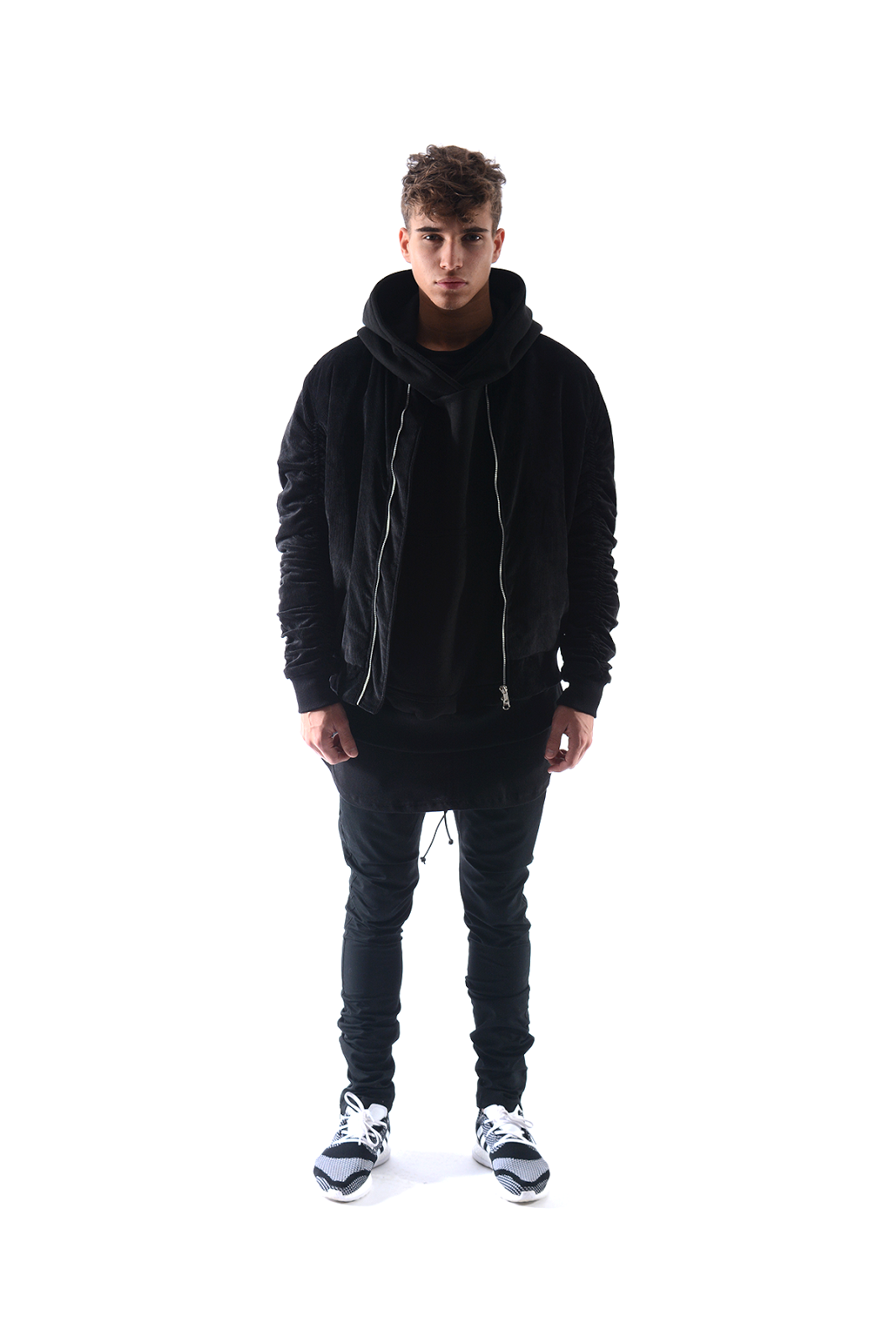
OUGD603 - 9 - Black Moniker, SS16 - Website

As part os this bief, the Black Moniker website need to be up to date with conent of upcoming products and Summer/Spring update or photographs. This task was straight forward as the photograph pages didnt need any layout altering. As the stocklist was increasing the page started looking like a long list, therefore a new grid layout on the page has been coded to create more readability for the page.The photographs that was sent for this particular task was a photograph not taken by myself and it had not be edited. So the photo was sharpened and colour corrected by myself.


by James Smith
Categories: , | Leave a comment

OUGD603 - 9 - Black Moniker, SS16 - Promotional material


As well as the product shots, the clothing was shot in multiple positions and stances to create more content for social media.

The studio content looked similar to the product shots, however they did not need a full white background. These where also shot on the same day as the product shots using the same Nikon D7100.

The main use for these photographs will be Instragram, therefore the photos needs to be good quality and have a similar colour / theme to keep consistency.


by James Smith
Categories: , | Leave a comment

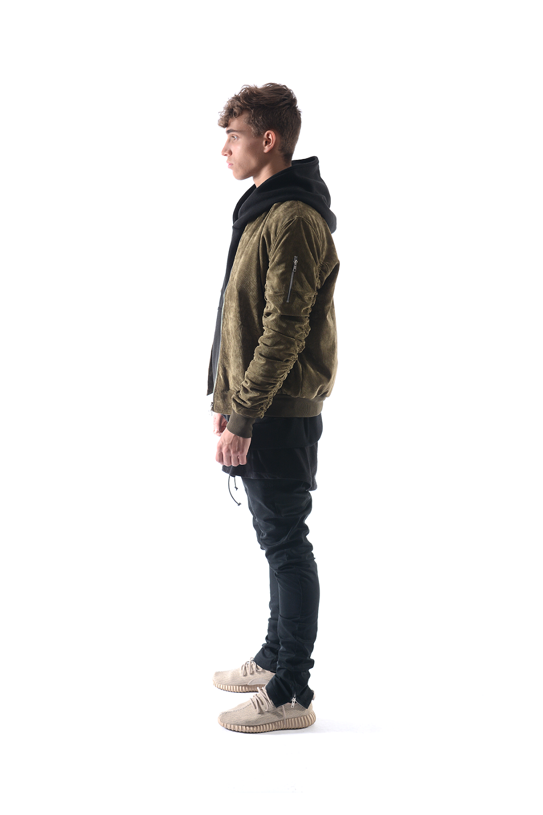
OUGD603 - 9 - Black Moniker, SS16 - Indoor lookbook


Black Moniker wanted an indoor lookbook for their website and social media.

The purpose for this photoshoot was to add a variety of content to their website and to have plently of social media content through out the Summer/Spring season.

These photographs where directed by myself in the same studio as the product shots.

The lookbook had to be landscape and colours had to be perfect. Therefore the photographs were taken on a Nikon D7100 and then touched up on Adobe Photoshop.


by James Smith
Categories: , | Leave a comment

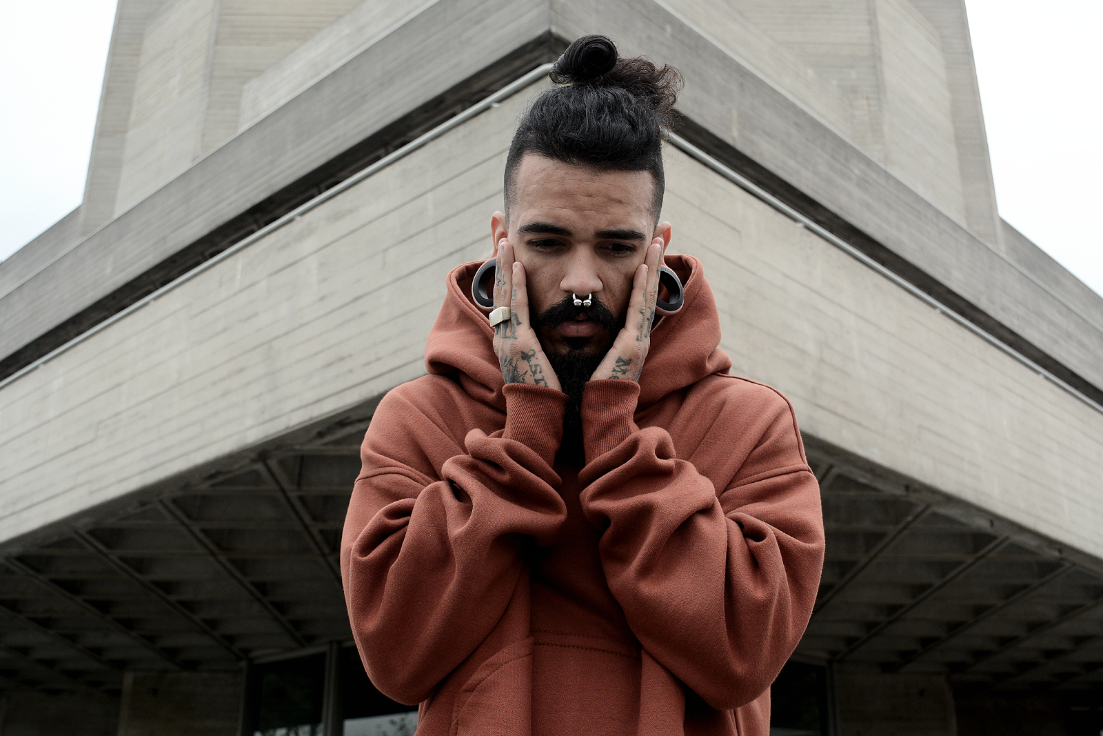
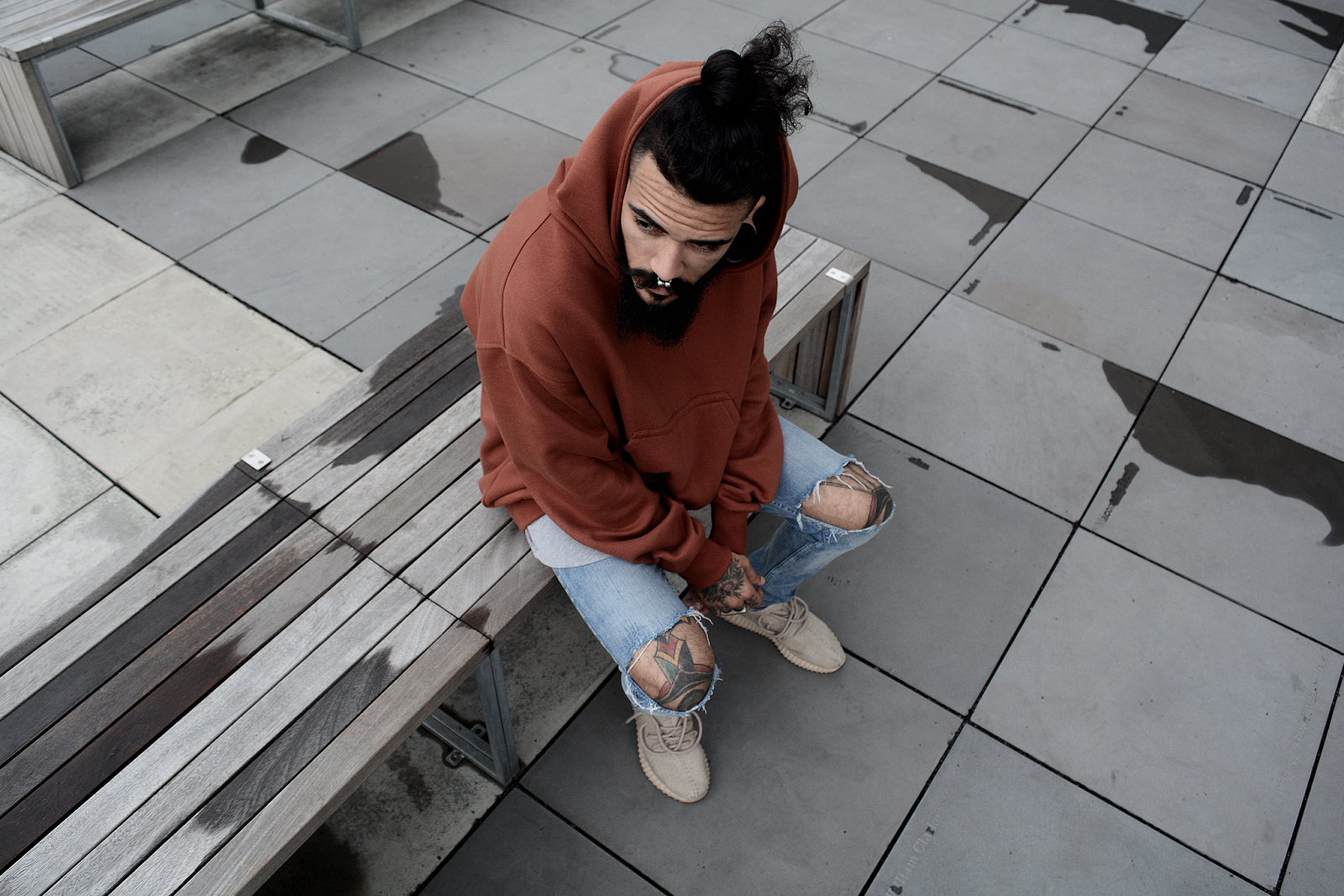
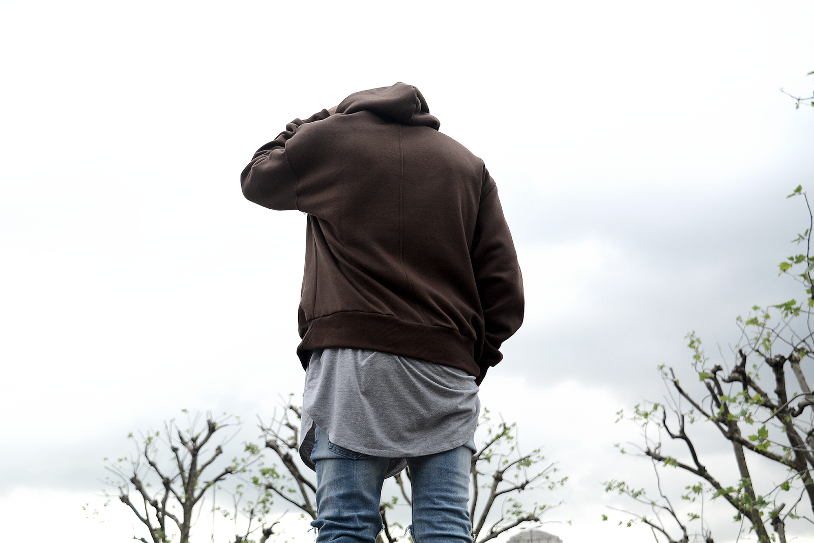
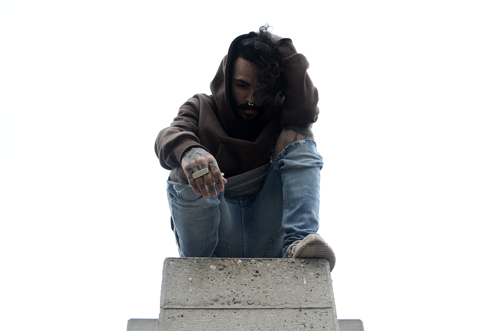
OUGD603 - 9 - Black Moniker, SS16 - Outdoor shoot & lookbook


The outdoor photoshoot took place in London, along side the River Thames.

For this photoshoot, it was essential to have background walls that are grey / stone. This is to keep consistancy within the photographs and will allow them to look similar even when the weather changes.

The photogaphs were taken on a Nikon D7100.

The colour were then touched up on Adobe Photoshop and sharpened.

The photographs also had to be resized to fit the website and social media.


The location was found by the owner of Black Moniker but the photoshoot was lead by myself.

As Nik spoke in a unique style by using his hands alot, we experimented by him telling a story while the photoshoot took place, to create a new, more natural style.

The model is Nik Hampshire, a professional model from America who was travelling Europe.


by James Smith
Categories: , | Leave a comment

OUGD603 - 9 - Black Moniker, SS16 - Indoor shoot

The raw shots from this shoot was alot better then the ‘Abyss’ shoot as the correct lighting was provided at the photo studio. The photographs now needed to be completed with white backgrounds and this will be carried out on Adobe Photoshop.All product shots where taken in a studio in Manchester. For this photoshoot, the camera had been upgraded to a Nikon D7100, which was an improvement from the Nikon D3100, however finding setting sometimes took more time. The model was a professional model from Manchester and was contacted by the owner of Black Moniker.


Overall the final product shots came out in great quality, with a good use of colour and shadows.

The collection had around 30+ products, which gave a total of around 140 photographs.

When photographing the products, front, back, side and 45 ̊ where the essential. Some of the more detailed products however, needed additional photographs.

All images where edited on Adobe Photoshop. Editing included levels, colour cuves and sharpening. Then all saved at
1500x100 pngs.


These images where all aproved by Black Moniker and are set to release on the 27th of May 2016.


by James Smith
Categories: , | Leave a comment